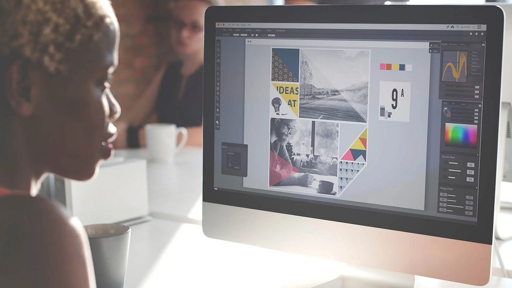
Brochure design is not the easiest work, especially if you want to create something that truly stands out. However, it may be a delightful task if you avoid using brochure templates and allow your ideas to flow. You will find a few tips in this article to help you create more effective brochures.
Suitable Structure
You must complete this as the initial phase in the brochure-making process. Try to suggest the best media for what your customer needs to convey; you would typically talk about it with the customer.
It works best to think outside the box regarding your brochure’s format. In modern times, many music promoters design pamphlets that unfold into posters. It will be convenient to hang it somewhere in the space to ensure the brochure is always visible and straightforward to post. If you decide to make such a poster, be artistic since the more attractive the artwork is, the more people will display it.
Create What You Want To Say
Although it may seem premature to start writing the brochures’ material, doing so will assist you in determining the ideal kind of brochure for your offering.
Create an outline for the content that you wish to use in your brochure while keeping the standard structure in your thoughts. A title or a brief bio is often on the front of the page, and the contact details tend to be on the opposite side of the cover.
Since this material will be adjusted and changed throughout the process to accommodate the booklet’s style, it is essential to emphasize the topics you cannot comply with.
At this point, users can choose what belongs on the main page and what belongs on the back side. You will have a better grasp of what kind of brochure you require if the description is more detailed.
Flyers
Typically, flyers are one-page booklets that promote a particular company. As the title suggests, they are lighter in weight and are often seen flying throughout.
The flyer must be particularly eye-catching and bold because it has only a limited amount of space and is intended for readers with a brief attention focus.
The majority of crucial information must be conveyed in only one glance. And if somebody is interested sufficient to turn it across, you are welcome to use the flipside to incorporate further information. If you need some inspiration for designing flyers and other visuals, make sure to check out Altlier.
Various Brochure Design Styles
Brochure design styles vary widely. For example, they can be:
- Trifold
- Roll-Fold
- French Fold
- Z Fold
- Open Gate Fold
- Multiple Folds
- Booklet
- Perfect Binding
Cut Down on Big Words
It is important to avoid using unnecessarily complicated language in your brochures. You should also not use flowery language to dazzle your target audience. The more you employ them, the more challenging it will be for you to make your primary point. Simple language is the most suitable choice for pamphlets.


